Showing posts with label fonts. Show all posts

Tuesday, December 28, 2010

Fonts on Display


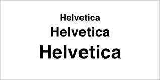
Ever since taking a two-semester course on the History of the Printed Book in library school, I have been fascinated with fonts. MIT Musem's Compton Gallery is hosting a show, "Types We Can Make," that highlights new fonts created by Swiss designers from the University of Art and Design in Lausanne. The MIT show is the subject of an article in today's Boston Globe. Switzerland has a distinguished tradition of modern font design starting with Helvetica, which the Globe describes as at once "humble" but "eminently readable," "a giant among fonts." Helvetica is a sans-serif font, which means the letters are clean, and don't have extra strokes on them. The modern Swiss designs are like Helvetica in that they are "exacting and verging on mathematical. White space plays as pivotal a role as curves, stems, and serifs. And, although forward-looking, the Swiss designers are always mindful of tradition."

The Globe article asks why any of this matters. "Type conveys ideas and emotion." Fonts, although easier to create through the use of design software, are more important than ever in order to create custom branding for corporations. Marketers devote a lot of attention to fonts because they know that fonts convey a message to potential consumers of their products.

Sunday, September 19, 2010

Focus on Fonts


I first got interested in fonts when I took Professor Terry Belanger's course "History of the Printed Book" at Columbia University's School of Library Service in 1974. Professor Belanger devoted a large portion of the course to discussion of font design, and by the end of the semester, most of us could recognize the fonts used in early printed books and threw around technical terms such as "sans serif" with ease. This experience came back to me when I read in the Boston Globe an article on Matthew Carter, the "celebrated typeface designer." The article is accompanied by a short but informative video in which Mr. Carter discusses his work on the redesign of the Globe in 2000. The font he designed for the Globe, Miller Globe Text, is still being used today for the print newspaper; the online newspaper is produced using the Georgia font, which Mr. Carter originally developed for Microsoft. Another of his well-known designs is Verdana from 1994, "a revolutionary font for having prevailed over technical constraints of that time, like coarse computer screen resolution." Mr. Carter was involved from an early stage in creating fonts that would be easy to read on screen.

'For better or worse, I did get involved in this at an early age, and I do have a sense of being part of a continuum that's technical ... I've lived through the change from metal type to film to digital and from the desktop and to the Web to wherever we are now--I don't know--so I've had to adapt to these changes, and I've done so very readily, I've been glad to do that.'

Mr. Carter is going to be honored for his work next Friday by the Boston chapter of the AIGA, which is, according to its website, the "professional association for design." Matthew Bacon, president of the board of AIGA's Boston chapter, states that "honoring [Carter] is honoring the differences that design makes for the human experience."

For more information about Bitstream Charter, the font shown in the illustration above, click here.